Behind-the-Scenes of the AD Greenroom:A Design Blog, August 2007
Source: Behind-the-Scenes of the AD Greenroom:A Design Blog
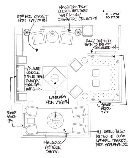
Green, “Green,” Greenroom July 24, 2007 at 7:52 pm | In AD Greenroom - Primetime Emmys | When I was first approached by Architectural Digest to do the Greenroom for this year’s Primetime Emmy® Awards, they told me that they wanted it to be an environmentally friendly room. We have done a number of “green” projects so that was not a problem, but one of my first thoughts was that this presented a great opportunity to dispel the notion that a “green” space had to be either cold and contemporary (with lots of steel and bamboo) or that it had to be typically “Birkenstock-y” and funky. With the wide range of eco-friendly products available today, it is no longer necessary to make the trade-off between luxury and “green.” This year’s greenroom would showcase the concept of “Eco-Luxury!” I wanted to show that a space that is truly luxurious and elegant can also be warm and comfortable. Rooms should be places where we can feel at ease to really use without having to worry about putting our feet up on the sofa or place a glass on the table. In all of our projects, we try to create an atmosphere of casual elegance where comfort and luxury go hand-in-hand. Finally, when I looked at the Architectural Digest Greenrooms done for past Emmy awards, I found that none of the spaces had incorporated the color green. As a color, green is known to be calming, healing and easy to live with. The purpose of a Greenrooom is to have a space where the performers can relax before going on stage so it seemed only natural to use the color green throughout the space. So for the first time this year’s Architectural Digest Greenroom for the Primetime Emmys will all be done in various shades of green. I like to think of it as the green, “green,” Greenroom! When I was first told all of the logistical goals for the AD Greenroom, I thought to myself “how is that even possible?” The overall space is quite small and yet it has to have seating for up to 20 people at any given time, it needs to have a lot of surfaces to provide refreshments for the performers, it needs to have a minimum of three large television monitors so that people can follow the awards from everywhere in the room….the list of objectives went on an on and in addition to all of that, it has to be beautiful in keeping with Architectural Digest’s position as the pre-eminent design magazine in America. No easy task! The space that is allocated for the Greenrooom is directly off of the stage of the Shrine Auditorium, but it is a wide open space with only two existing walls and a set of stairs going to the outside in the middle of one of those walls. There is a large structural column that is placed 6 feet into the middle of one of the corners. The first thing that I thought about in designing the space was creating an environment that immediately telegraphed a warm, inviting space. I considered the kinds of spaces that make people feel comfortable and I thought about old paneled wood rooms that are warm and casual-looking while providing a kind of natural backdrop to any number of different styles. Our firm has done a lot of wood-paneled rooms before, but in this case we would have to design a “room” that could be quickly installed into an open space backstage at the Shrine Auditorium in Los Angeles. We will have just two days to install all of the walls, bring in the furniture and lighting, hang paintings and set up the Sharp AQUOS televisions that the stars will watch to monitor the awards as they are happening. We decided to use an existing structural column that sits in the middle of the space to help give us an entrance into the Greenroom and also provide some privacy so that other people who will be backstage during the awards won’t be able to easily look inside and see who is in the Greenroom. We also created a slightly separated area that is formed by two false columns to carve out a kind of alcove that will allow the celebrities a place to be interviewed or talk a little more privately. A large wrap-around banquette will be utilized in another niche to provide maximum seating. Small chairs will be spread around the room to provide multiple seating areas. In order to help re-inforce the feeling that this is an actual room (and not just a space backstage), we are creating a false skylight from which a large lantern will be suspended. Here is a furniture plan for the Greenroom.
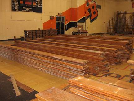
A Football Stadium’s “Second Act” August 23, 2007 at 12:39 pm | In AD Greenroom - Primetime Emmys, Green Design, Materials | In creating a “green” environment, the first step was finding a wood supplier that specializes in environmentally friendly options. All of the wood for the paneled rooms is supplied by Terra Mai, a wood supplier based in Northern California. In addition to selling wood that is approved by the Forest Stewardship Council, Terra Mai also has old wood that has been reclaimed from earlier uses—this is really a “green” solution because no new trees had to be cut down to create the Architectural Digest Greenroom. All of the wood for the Greenroom comes from an old torn-down football stadium from a high school just south of Los Angeles. It already has a great patina from years of being outside in the southern California sun. Here’s a photo of the original stadium wood stacked up in the high school gym in anticipation of its next “life.”
In order to build the room, we decided to turn to a real master craftsman in wood: Jose Wawrik of JW CustomWood based in Los Angeles. Jose is originally from Argentina and has created some amazing paneled rooms for us in multi-million-dollar mansions in Beverly Hills, Brentwood and other high-end areas in Southern California. Jose is a treat to work with because he is a true artist when it comes to wood. We have worked together often enough that he really understands the look that we are trying to achieve for the Greenroom: my goal is for it to look like a room in an old English country house that has been around for years. There will be 10-and-a-half-foot-high paneled walls with a pair of draped “windows” at two ends of the main room. Disney Inspiration August 27, 2007 at 8:56 pm | In AD Greenroom - Primetime Emmys, Materials | Most of the furniture for the Architectural Digest Greenroom will be supplied by Drexel Heritage using pieces from their new Walt Disney Signature Collection; this seemed like a natural fit for the Greenroom—not only was Walt Disney one of the most beloved figures in Hollywood, but my earliest memory of television as a child was the Wonderful World of Disney each Sunday night. How perfect, I thought, that we would use the Walt Disney Signature Collection for the Greenroom of television’s biggest night: the Primetime Emmy® Awards! All of the furniture from the Collection has a great mid-century look and I love the way contrast it will provide to the traditional look of the Greenroom’s walls. I hate it when a space or home looks like it all came from the same period or store; a space like that looks unimaginative and bland. Part of my design philosophy for all of our projects is to achieve a kind of “tension” in a room that is brought about by mixing pieces from different periods or styles. I love mixing a fine 18th-century piece of furniture with a very contemporary painting or photograph. When you do that, you can’t help but see both pieces in a different way and the overall experience of the space is much richer and more interesting. To me, nothing is worse than looking at a space that looks as if it had all just been delivered from a store or showroom! Here are some of the pieces of furniture we will be using from the Walt Disney Signature Collection for Drexel Heritage:


From left to right: Holmby Chair; Kingswell Chair; Silverlake Oval Commode; and Studio Martini Table. Antiques (the Ultimate in “Green” Design) and Fabric Selections September 6, 2007 at 12:54 pm | In AD Greenroom - Primetime Emmys, Green Design, Materials | In addition to the new furniture pieces by Drexel Heritage, we are including some wonderful antique pieces from my own Timothy Corrigan Antiques collection that are available online through www.Timothy-Corrigan.com and www.1stdibs.com. Most people don’t think of it, but antiques are really the ultimate “green” product; by using pieces that were made long ago, no new resources are used or depleted. The antique pieces that will be used in the Architectural Digest Greenroom include an amazing carved wood console table from Italy that was made in the 18th century, and a beautiful marble center table fashioned from many pieces of rare specimen marble. Here are photos of these two antiques:
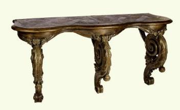
18th Century French Oak Console Table

Inlaid Speciman Marble Center Table When it comes to the selection of fine fabrics, it becomes much more difficult to be totally “green;” there just aren’t that many options available on the market today that use all-natural growing processes and only natural dyes. All of the fabrics utilized in this year’s Greenroom are from Scalamandré—one of my favorite fabric houses—and are made with 100% natural products: cotton, wool, linen or silk. I consciously stayed away from products made from synthetic materials in an effort to be as environmentally sensitive as possible. The fabrics are in a wonderful range of green colors—from a deep, rich, dark green to lighter olive greens. I carefully selected fabrics that are mostly solids because the space is not terribly large, and introduced a few patterned fabrics for the drapes and some of the accent pieces. Scalamandré fabric swatches for furniture pieces in the AD Greenroom:



Roll Out the Green Carpet… September 6, 2007 at 5:42 pm | In AD Greenroom - Primetime Emmys, Timothy Corrigan, Shrine Auditorium, 59th Annual Primetime Emmy Awards, Architectural Digest, Eco-Luxury, Materials, Carpet, Green Design, Backstage, Design | The carpet for the Architectural Digest Greenroom is by Karastan. Of all of the carpet manufacturers, Karastan is one of the most environmentally conscious; its parent company Mohawk has made huge efforts in this area and interestingly enough, today they are the largest recycler of plastic bottles in America! The carpet I selected for the AD Greenroom is made of 100% New Zealand wool and will be made of a very tight weave. Tight-weave carpeting is the more “green” way to go (versus a looser weave or plush carpet) because over time, it will wear much longer and won’t need to be replaced so soon. Because we are keeping the Greenroom green in color as well as being “green,” we selected a carpet called “Woolcheck Naturals“ in a wonderful shade called “Aspen Mist.” Here’s what the carpet looks like:
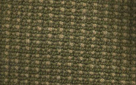
Karastan Wookcheck Naturals Carpet in Aspen Mist Pre-Construction Preparations| Part 1 September 7, 2007 at 9:32 am | In Timothy Corrigan, Shrine Auditorium, 59th Annual Primetime Emmy Awards, AD Greenroom - Primetime Emmys, Eco-Luxury, Materials, Pre-construction, Backstage, Design | Just a few days ago I came back from the workshop where we made the paneled walls that will make up the Architectural Digest Greenroom. Because the wood maker Jose Wawrik has a huge warehouse, we were able to assemble an actual room that is the exact size and configuration of the Greenroom! We replicated the room’s exact dimensions down to the inch in order to make sure that on Monday, September 10th—the one day that we have to install the Greenroom—we will be able to bring all of the walls into the Shrine Auditorium and have them fit perfectly to create our backstage oasis for the big night. The Primetime Emmy Awards (as do most television shows) use union labor, so all of the actual installation of the Greenroom and all of the stage sets must be done by members of the Local 33 of the International Alliance of Theatrical Stage Employees; they will have only three hours to assemble an entire room that we want to look as if it had been in an old English country house for centuries. I have never had to construct an entire room with such detailed precision; there will be no time or room for any errors or last-minute adjustments. Here is one of the detailed drawings we developed in order to create the paneled walls:
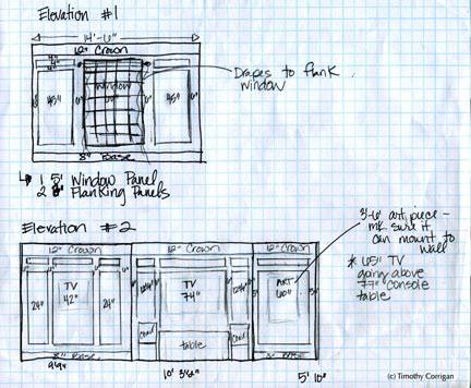
This is an overview of two of the walls and as you can see, each wall has a code–Elevation #1 (E1), Elevation #2 (E2), etc.–that corresponds to the various walls or elevations of each part of the room. We have factored in the exact size of all of the Sharp AQUOS Full HD LCD TVs that actually will be recessed into the paneled wood walls of the room. All of the other details, such as the location of the light sconces and the size of the art, have been factored in as well. I have my fingers crossed that we have all of the dimensions correct so that we don’t have any surprises on install day! Pre-Construction Preparations | Part II September 10, 2007 at 10:38 am | In AD Greenroom - Primetime Emmys, Timothy Corrigan, Shrine Auditorium, 59th Annual Primetime Emmy Awards, Architectural Digest, Eco-Luxury, Materials, Pre-construction, Green Design, Backstage, Design | During the pre-construction workshop we measured and re-measured each of the support walls onto which we will attach the wood panels. If all goes according to our very-detailed plans, these panels will transform the backstage of the Shrine Auditorium into a space that resembles an elegant country house in the English countryside. In addition, we are building a large custom upholstered banquette that will need to fit exactly into a paneled wood niche, so we have to be sure that every ½ inch is perfectly-measured and accounted for! Here’s the team working on the room:
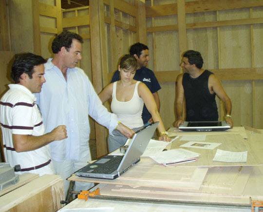


The guy in the sleeveless tee shirt is Jose Wawrik, the man responsible for the logistic of creating this room that needs to be taken apart and re-assembled in just a couple of hours time. You can also see Renato Basile, one of the producers of the Primetime Emmy Awards show. This is Ron’s third year working on the show and he is a real goldmine of information and experience. He has great stories about the mishaps from previous Greenroom installations—I want to make sure that he doesn’t have any embarrassing stories to tell about this year’s Greenroom! Ron also brought along another member of the Primetime Emmy Awards production team. The beautiful young woman in the photos is Julie Fullman from our design firm. Julie is an incredibly organized and detail–oriented person, and she has this entire project totally under control. In the photos above you can see the basic support walls of the future Greenroom and even some of the initial wood paneled sections. Once all of the panels were up we started the process of treating the wood with natural oils to achieve an aged wood look; because we are doing everything possible to create a really “green” Greenroom, we did not use any chemical products to achieve the look of an old paneled wood library. Creating a Balanced Greenroom September 12, 2007 at 11:56 am | In 59th Annual Primetime Emmy Awards, AD Greenroom - Primetime Emmys, Architectural Digest, Art, Backstage, Design, Eco-Luxury, Materials, Shrine Auditorium, Timothy Corrigan With the walls of the Architectural Digest Greenroom constructed of more “traditional” looking wood-paneled walls, I want to include a number of pieces of really incredible contemporary art and photography to help “balance” the room and give it a sense of modernity. I really like it when a room has a mix of periods, styles, moods and materials: a piece of beautiful, refined silk looks much more interesting when it is set against a piece of rough wood than it does when it is paired only with a piece of finely polished furniture. When a room is only decorated in one style or one kind of furniture, it can easily look stiff, “decorated,” or just plain boring. Better to walk into a very clean, sleek, contemporary space that has a couple of more ornate or complex pieces from another period; the juxtaposition of styles makes you see the pieces from each period in a totally different way than if they were all from the same period. We contacted a number of top art galleries around the country to see what we might be able to borrow for the big night. I’m including pieces of art from a couple of mediums in my effort to continue to make the room feel fresh. Ideally, we will have an oil on canvas, a photograph and perhaps a lithograph or print. So far, we have lined up a great collection of art pieces that will “test” when we do a trial installation of the furniture in the mock room we have set up. We have both an original oil on canvas as well as a signed lithograph by the celebrated artist Sam Francis. I love Francis’s work; his wonderful, colorful pieces would be a great contrast to the paneled walls. We also have some terrific photographs by Jim McHugh; McHugh does amazing photos of buildings from around the world. The ones that we will be using are of old Hollywood landmarks. We have a huge acrylic-on-canvas piece by an artist named Dan Maltzman; his works are very abstract and I think that his style will work well with the Sam Francis and the moody black and white of Jim McHugh’s photos. Here are some of the pieces of art that we plan on using in the Greenroom:
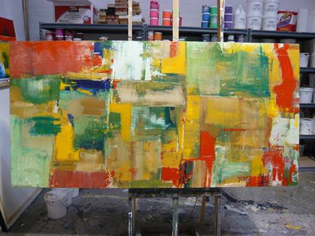
Acrylic-on-canvas piece by artist Dan Maltzman, viewed in the artist’s studio
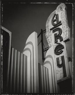
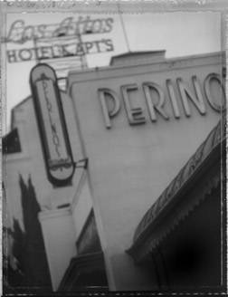
Photographs by Jim McHugh. Selected from the Wilshire Boulevard: The Miracle Miles portfolio; from left to right: El Ray, Perino. Click here to link to Timothy's AD Greenroom Design Blog: www.beyondad.com/adgreenroom